

Vizible Media Analytics
PRODUCT DESIGN & UX
Vizible was a media analytics platform designed to extract insight from online news coverage by analyzing language, relationships, publishers, topics, and sentiment. My role was to turn that complex analytical model into usable product experiences: customer portals, dashboards, and data visualizations that helped users explore the conversation and find meaningful patterns.
The design challenge was not simply visualizing data. It was creating an interface system that allowed users to move between documents, language comparisons, metadata, quantitative views, and actionable insights.
The product required multiple ways of understanding the same underlying corpus: document-level views, publisher-level patterns, language comparisons, and quantitative exploration. I designed portal structures and visualizations that helped users move between those levels without losing context.
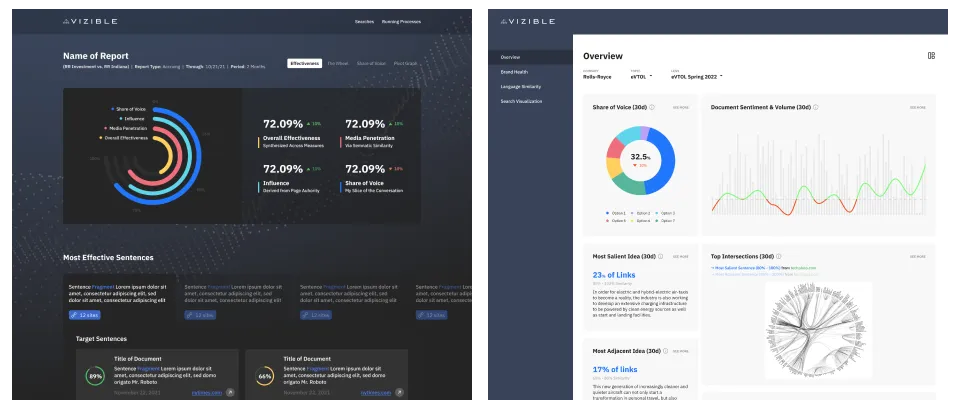
Effectiveness score andOverview screens from the customer portal
Scenario: as a marketer of electric vehicles, I want to understand how the language in my upcoming press release might be received by the news media covering that topic. Vizible's platform gathers the news media –digesting each article– and then performs a sentence-to-sentence language comparison between the press release and the news media.
"The Wheel" a modified hierarchical edge bundling visualization used for language comparison
The visualization shows how the press release relates to the entire discussion on electric vehicles, the kind of language the publishers use, and the extent to which publishers might quote (vs. loosely paraphrase) the press release.
Scenario: as a researcher in the world of electric vehicles, I want to understand the conversation quantitatively. Vizible's platform gathers news media on the topic, uses machine learning to understand each document, analyze the publisher and build a mesh of previously unseen metadata around the conversation.
Pivot View: a visual simulation of a pivot table
This visualization allows the user to stack, re-stack and shuffle these dimensions to find interesting data stories. A researcher might discover that when top-tier publishers talk about Rivian in a positive way, it's only when the story accompanies mentions of Elon Musk.